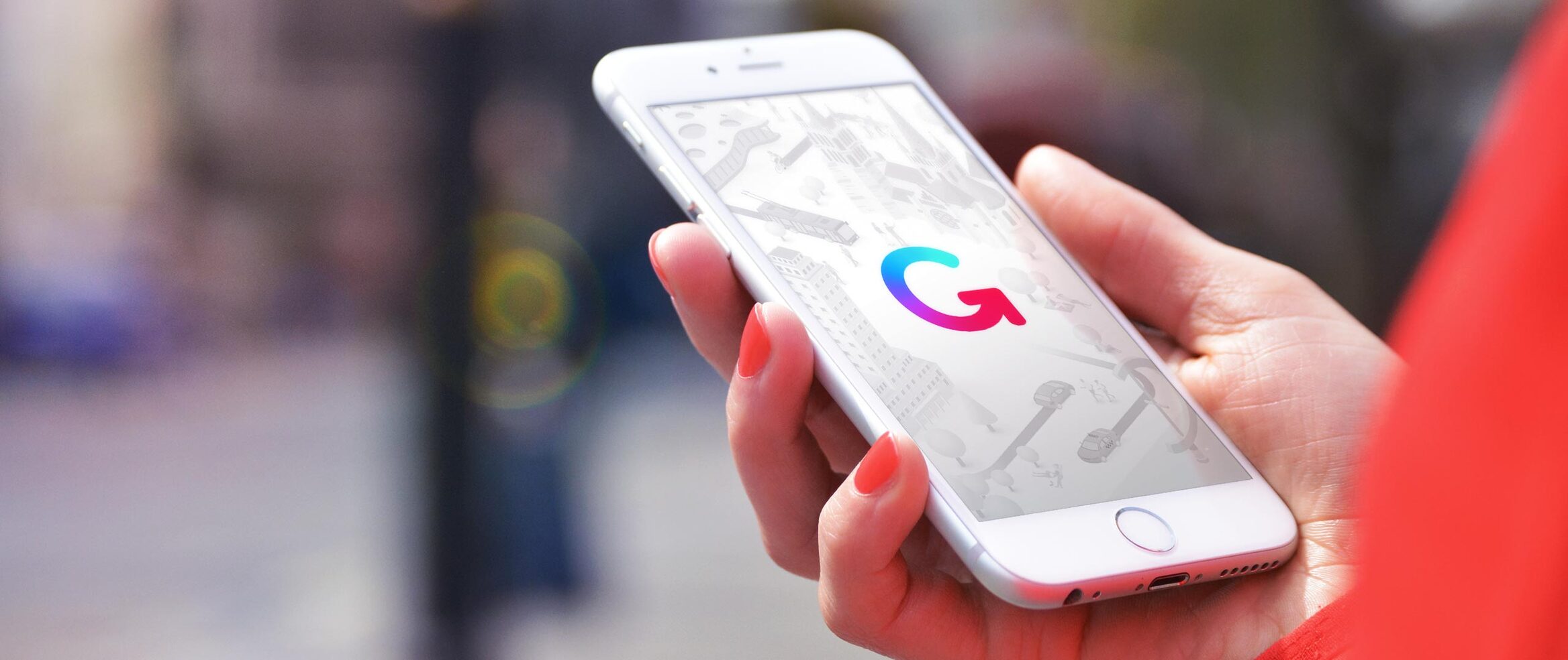
Branding - Public Transport Mobile Application
zenGo
year
2019
domain
Mobility as a Service
role
Logo design, visual identity, motion design, print, app design, website design and UX, communication
Illustrations by Florian Zumwald: tsoom.ch
assessment
Public Transport for Geneva (TPG) and Lausanne (TL) need to brand their new offer combining public transport to other means of transport.
challenge
Design a logo and visual identity that suits the two main clients and their partners and can be adapted to different markets while remaining highly recognizable.
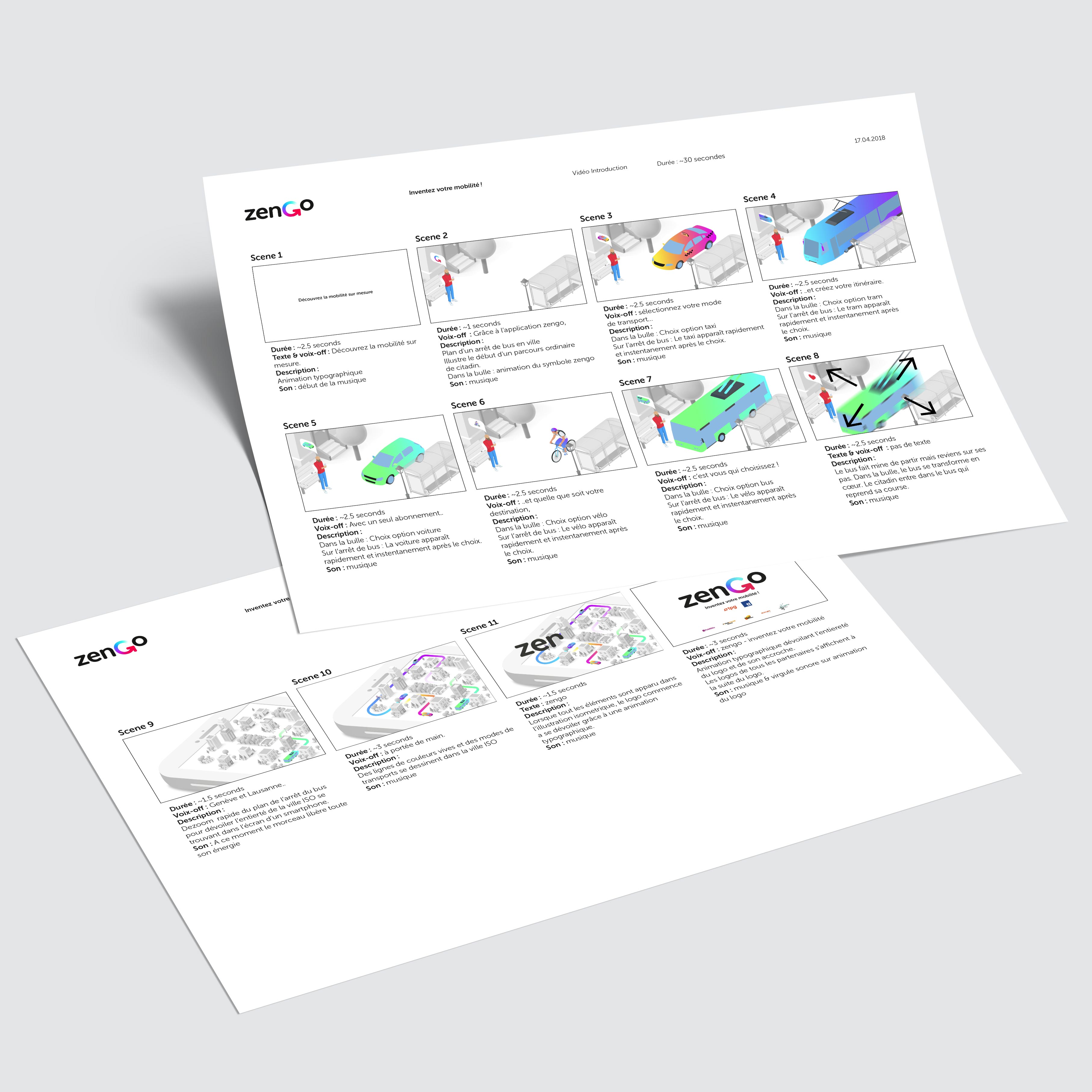
BRAND STRATEGY
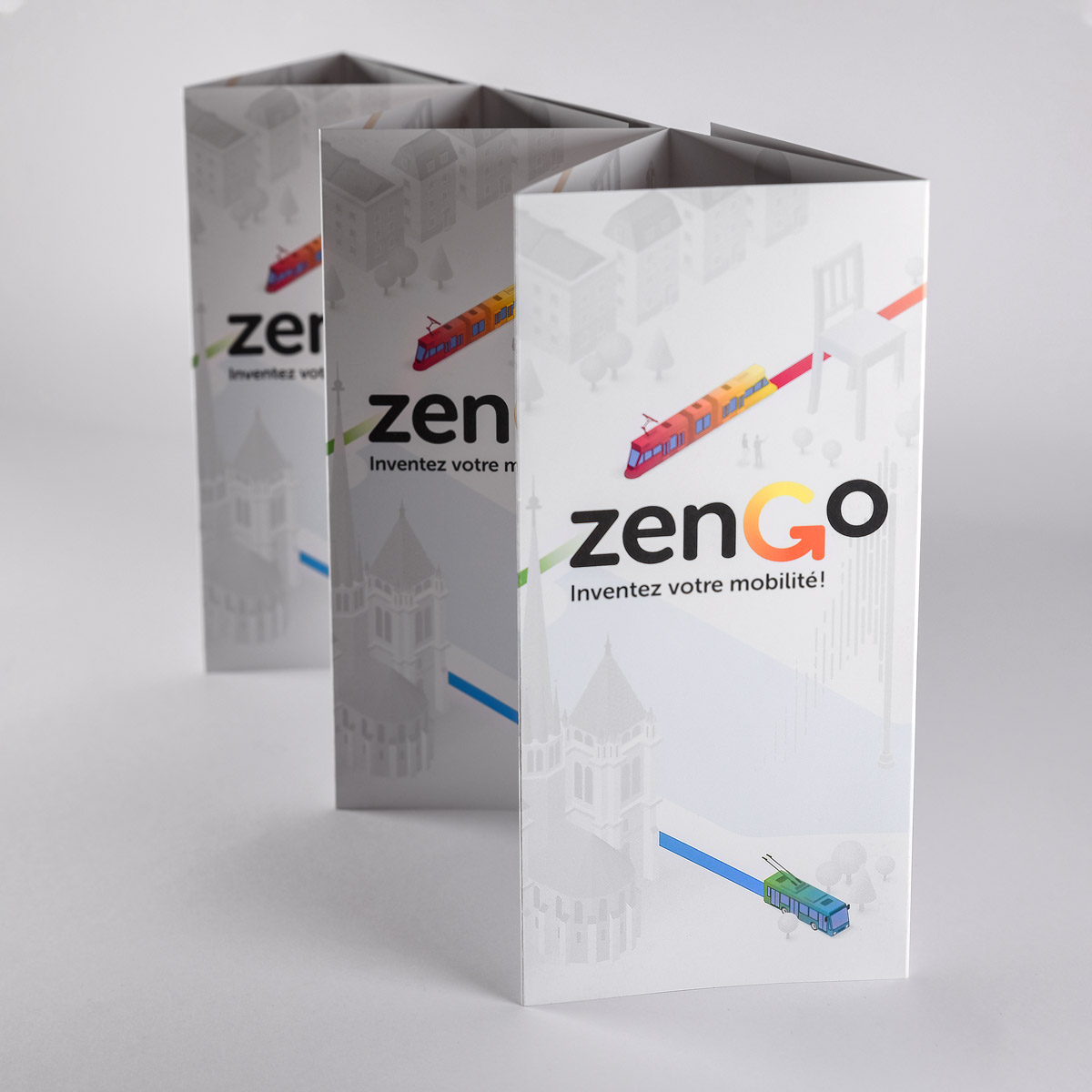
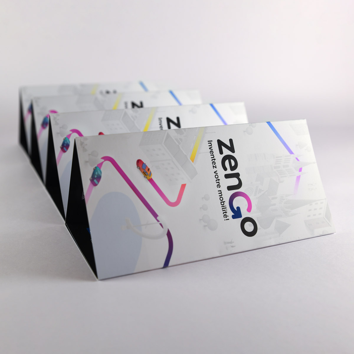
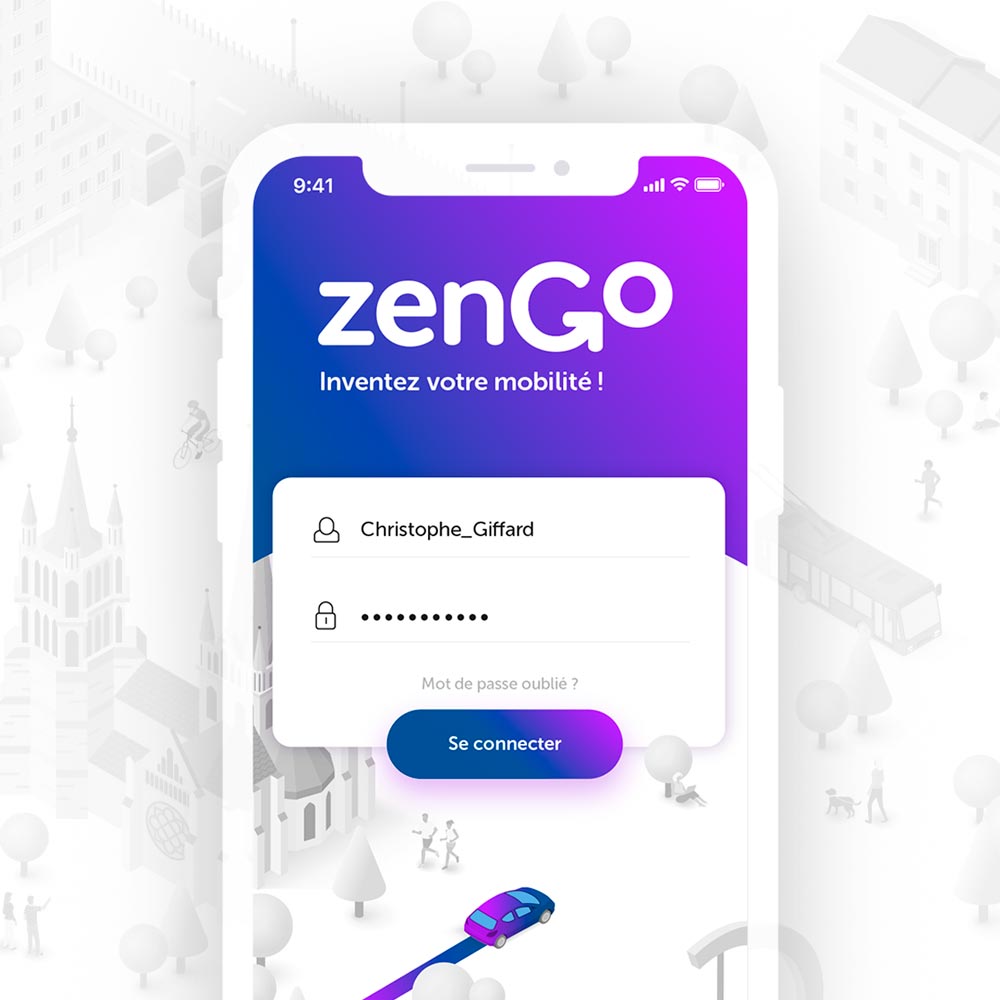
The G in the logo is an arrow representing motion and mobility. The color gradients change according to the market, with orange for Geneva (TPG) and blue for Lausanne (TL).


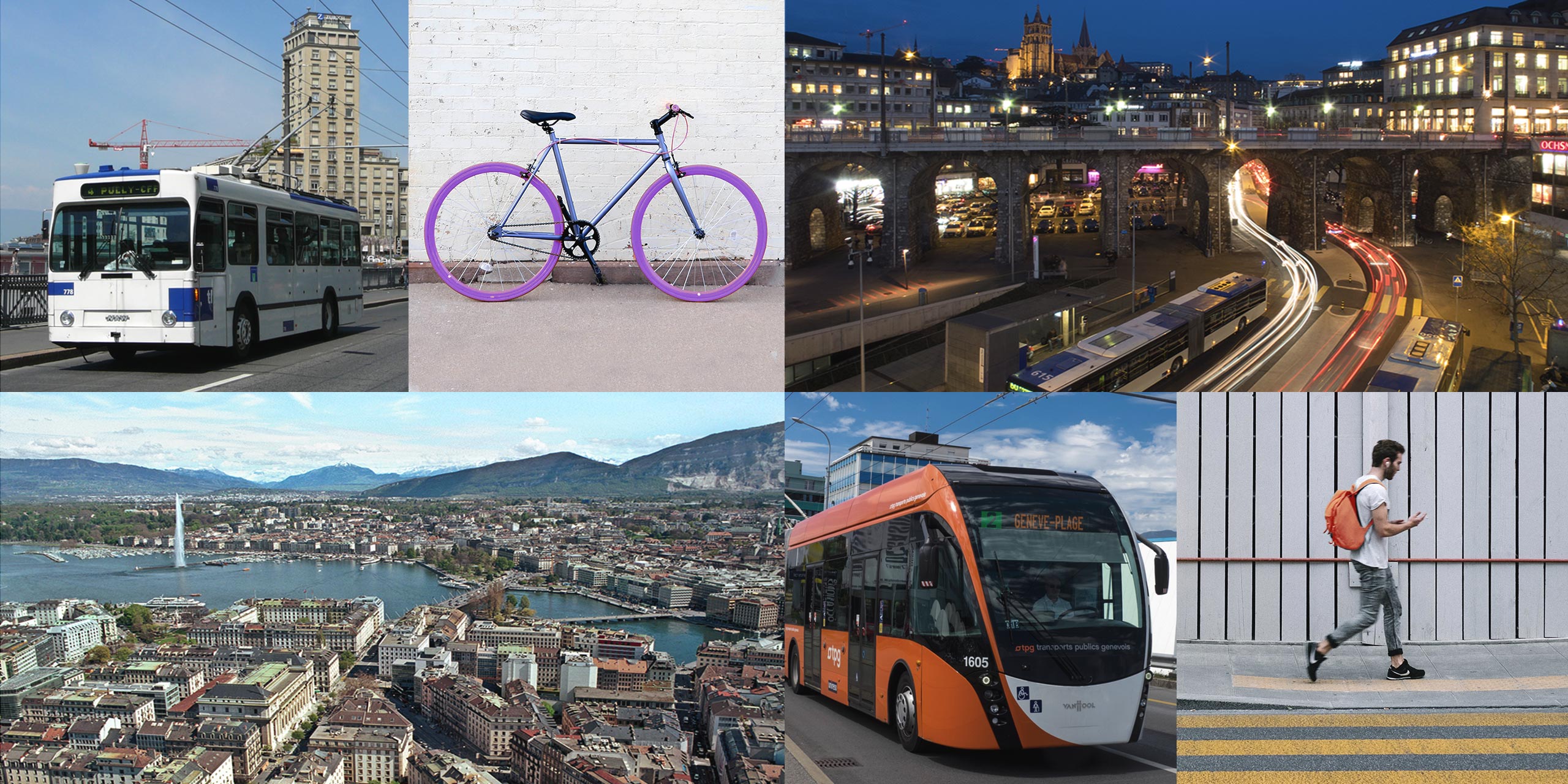
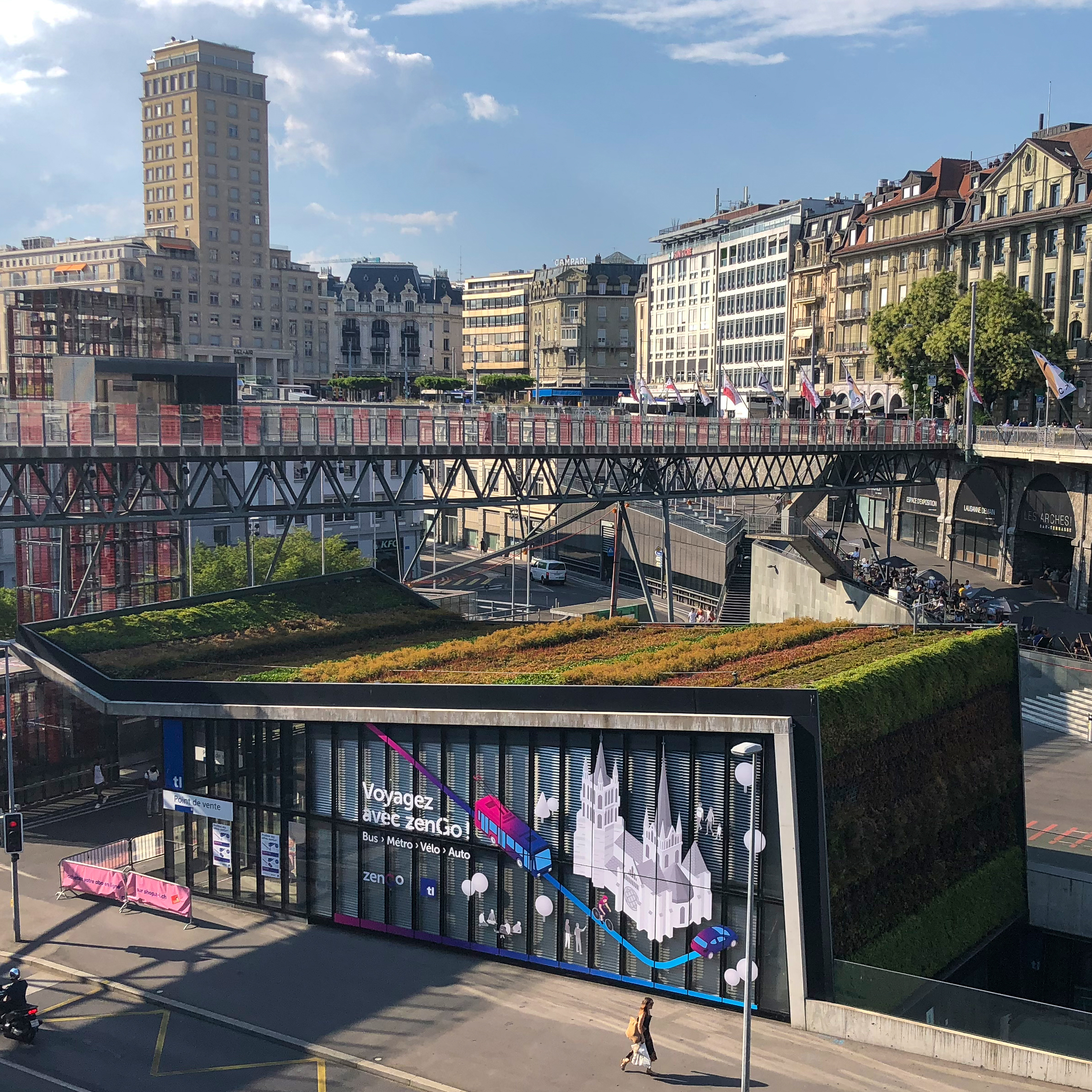
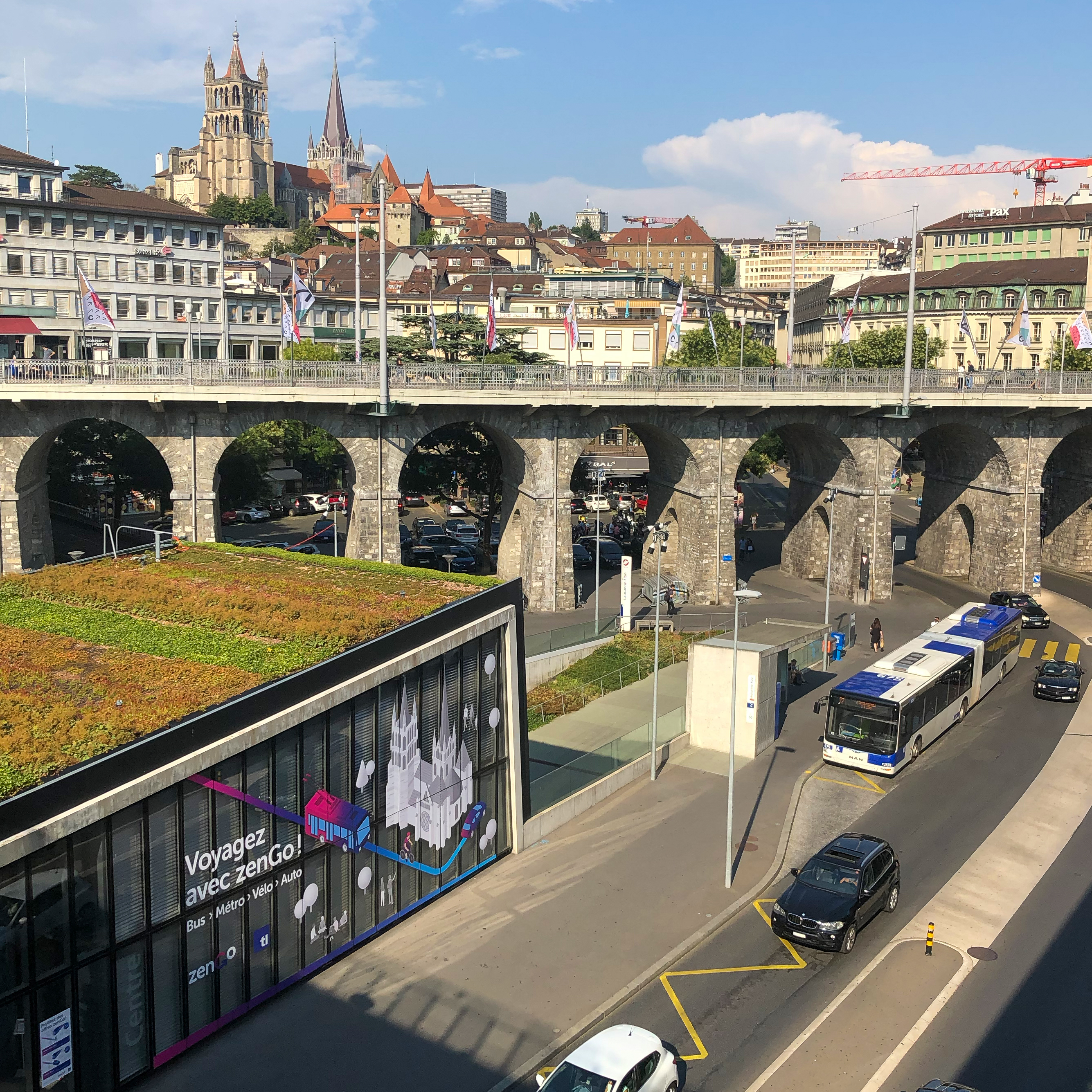
Visual Identity
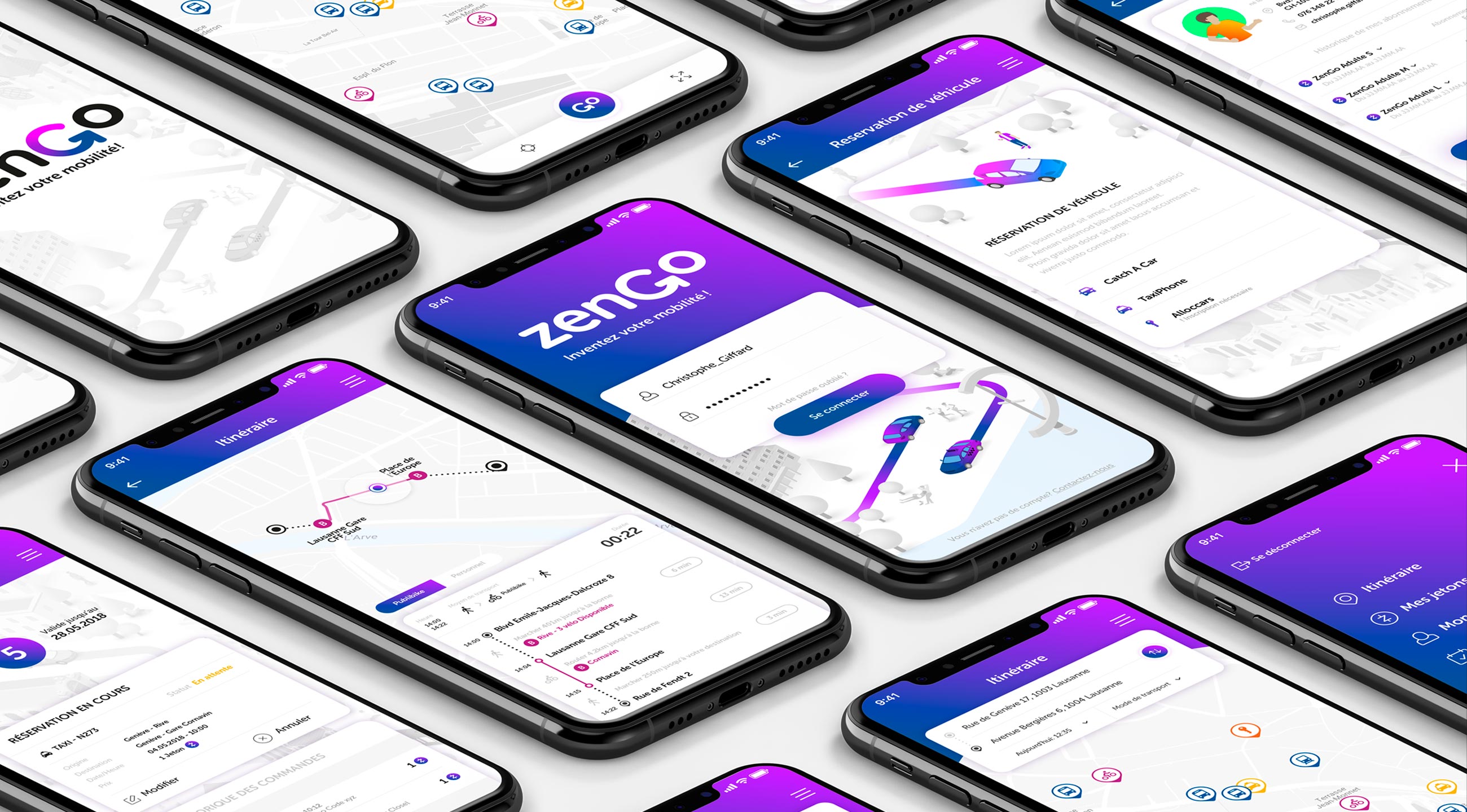
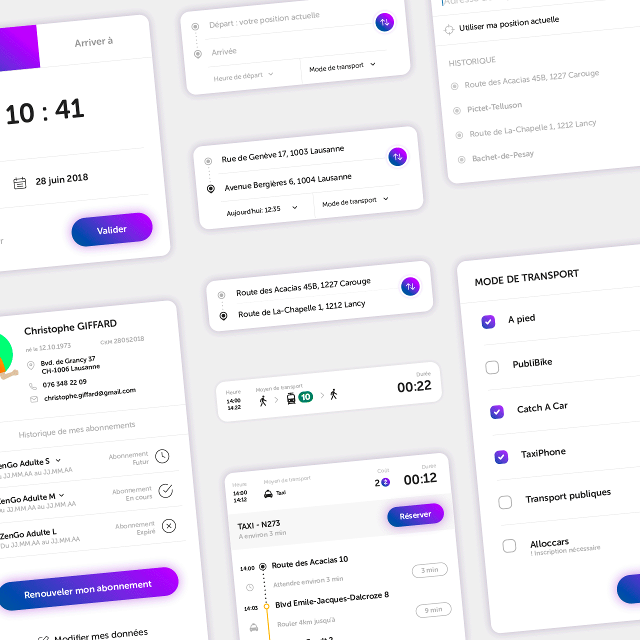
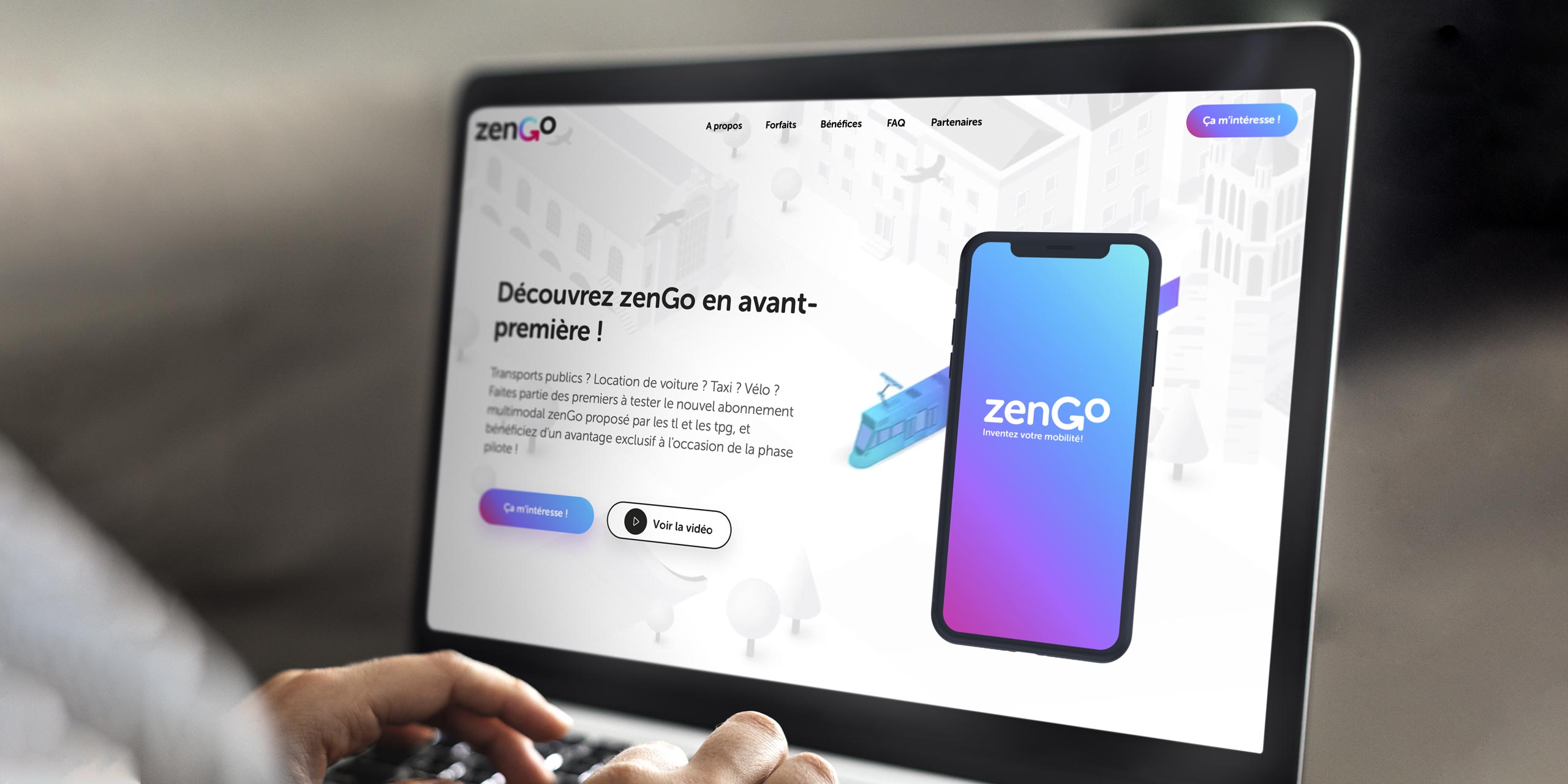
Color gradients reminiscent of the logo represent seamless multimodal journeys in a zen, isometric city.
Visual Identity
Illustrations


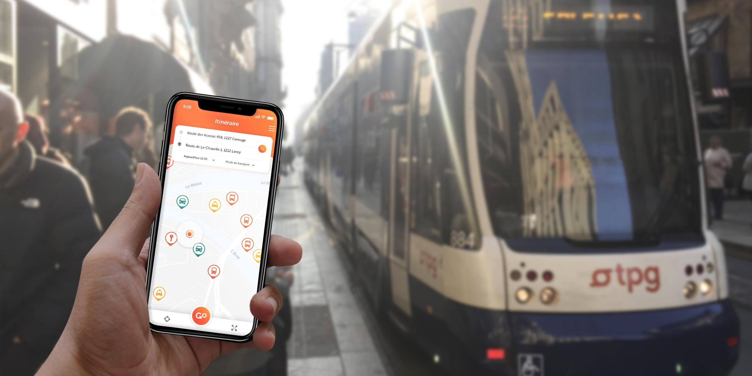
Brand Experience
Digital

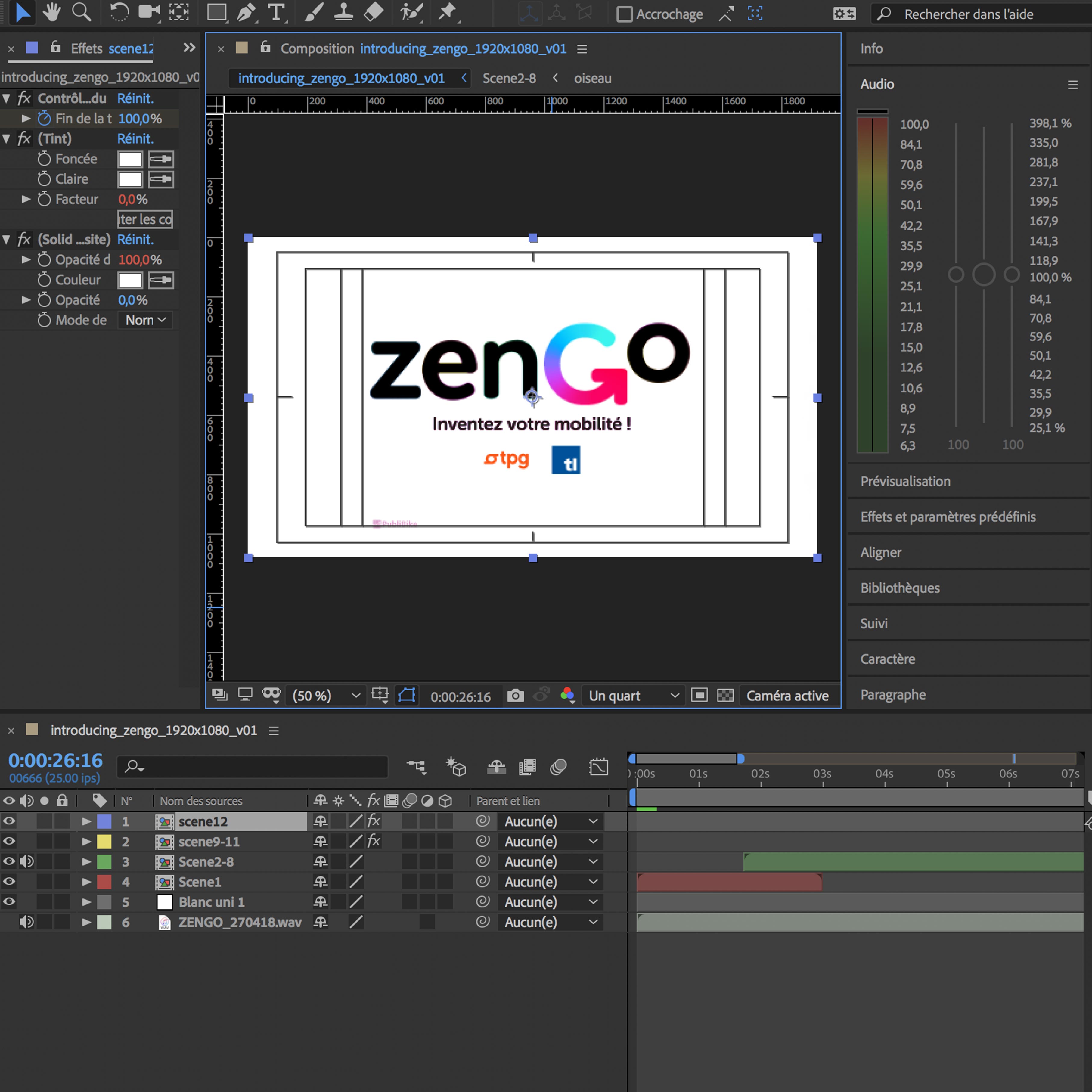
Animation
Motion design
TESTIMONIAL
«Pas facile de bien comprendre le positionnement de marque de zenGo et de trouver le ton juste pour transmettre les valeurs d’innovation, de changement et de mobilité durable. A la suite d’un concours passionnant, Parenti Design est nettement sortie du lot grâce à sa compréhension limpide des valeurs associées à notre marque. Les étapes qui ont suivi ont nécessité un travail important et de nombreux délais où la flexibilité et la rigueur de Parenti ont été des atouts indéniables.»
Jenoe Shulepov, Head of Communication - TPG, 2019
Discover even more projects
École des Musiques Actuelles
Rebranding, Iconography, Signage & Motion Design

Genève Aéroport - Concessions commerciales
Advertising campaign | Shops & restaurants
SIG - Eau de Genève
Advertising Campaign | Industrial Services
Association des communes genevoises
Visual Identity
Léman Bleu
National League | Saison 2022-2023

Fondation des Parkings
Advertising Campaign | Parkings
HES-SO Genève
Change le code !

Sother
Branding & Communication | Swiss vineyards

Genève Aéroport - Concessions commerciales
Branding & Communication | Shops & restaurants
Rhône Gestion
Branding | Asset & Wealth Management
SIG - Thermique2030°
Branding & Communication | Launch of SIG's Thermıque2030° program
ODDITY
Branding | Communication Agency
Sother
UI/UX Design

Jungle Studio
Branding | Brand Strategy Studio
Albinati Aeronautics
UI/UX Design
TPG
Advertising Campaign - Public Transport
BoomAgers
Branding - Marketing Agency
Chabrier Avocats
Branding - Law firm
Amadeus Capital
Branding - Asset Management Firm
Siena Dream Villas
Branding - Luxury rentals in Tuscany
zenGo
Branding - Public Transport Mobile Application
Alphaswiss
Branding - Wealth management advisory firm
tpgPreview
Launch Advertising - tpg mobile application
Fabbrica
Branding - Contemporary wine estate
Creaholic
Branding - Innovation factory
Albinati Aeronautics
Branding - Private Jets & Aeronautics
SEIC
Branding - Electricity, Multimedia & Installations Company
Cave de Genève
Branding - Wine Coopérative
The Business Harbour
Branding - Business Service Platform
Gallí Decoration
Branding - Interiors & Manufacture
Notz Stucki
Branding - Asset & Wealth Management
Castiglion del Bosco
Branding - Hospitality, Golf Resort & Wine
Le dolcezze di Nanni
Branding - Cantucci, Ricciarelli, Amaretti, Panforte di Siena
Clés du Climat Genève
Brand Identity | République et canton de Genève
Eightstone
Brand Identity System
World Climate Research Programme
Rebranding
Banque de Commerce et de Placements
Branding | Banque de Commerce et de Placements
Caisse de Prévoyance de l'Etat de Genève
Branding | Caisse de Prévoyance de l'Etat de Genève